CASE STUDY 03/ MEDITATION APP
CASE STUDY 03/ MEDITATION APP
HeartMind
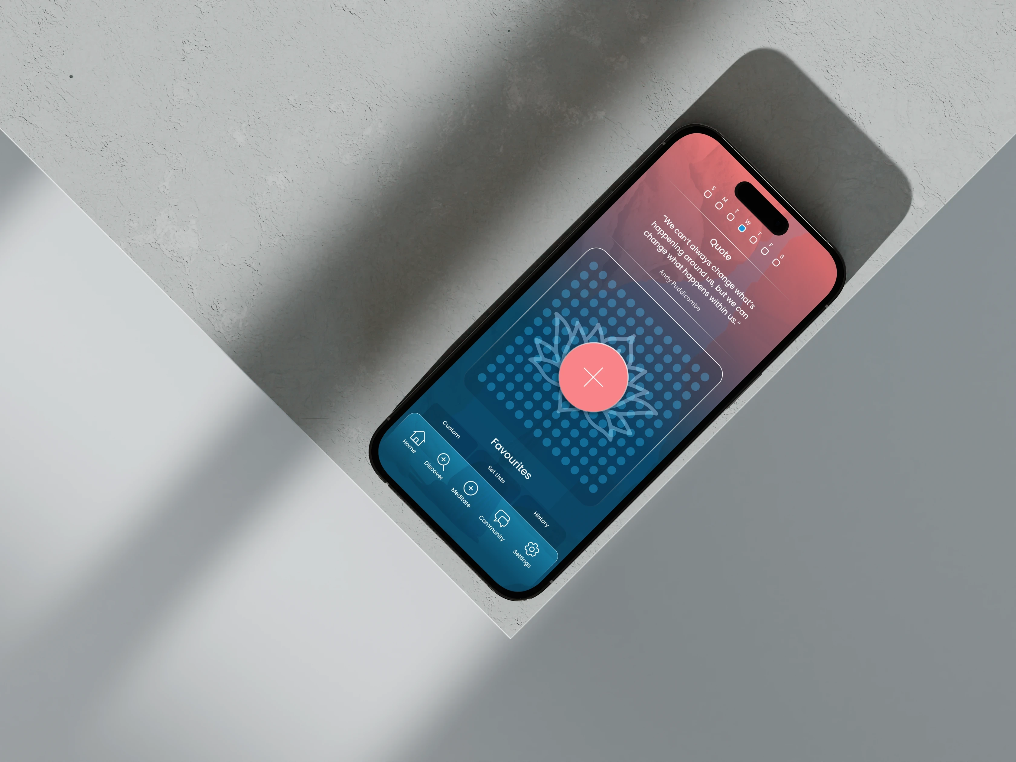
Many meditation apps are built to bring beginners back every day, with streaks, badges, and reminders. The ten practitioners I interviewed wanted something else: a session they could shape themselves, and then silence. So I designed HeartMind by taking things away.
Many meditation apps are built to bring beginners back every day, with streaks, badges, and reminders. The ten practitioners I interviewed wanted something else: a session they could shape themselves, and then silence. So I designed HeartMind by taking things away.
ROLE
Product Designer
TEAM
Solo, with developer Michael Phillips
TIMELINE
Jul to Aug 2025, BrainStation certification
SKILLS
User research, Information architecture, Prototyping, Usability testing
ROLE
Product Designer
TEAM
Solo, with developer Michael Phillips
TIMELINE
Jul to Aug 2025, BrainStation certification
SKILLS
User research, Information architecture, Prototyping, Usability testing
ROLE
Product Designer
TEAM
Solo, with developer Michael Phillips
TIMELINE
Jul to Aug 2025, BrainStation certification
SKILLS
User research, Information architecture, Prototyping, Usability testing
10
Meditators interviewed, from teachers to beginners
10
Meditators interviewed, from teachers to beginners
10
Meditators interviewed, from teachers to beginners
1
Session builder that lets meditators shape every stage
1
Session builder that lets meditators shape every stage
1
Session builder that lets meditators shape every stage
0
Streaks, badges, or reminders, because practitioners asked for less
0
Streaks, badges, or reminders, because practitioners asked for less
0
Streaks, badges, or reminders, because practitioners asked for less
SELECTED SCREENS
SELECTED SCREENS



THE PROBLEM
THE PROBLEM
Experienced practitioners, the people who meditate daily and know their own practice, are left with rigid tools that treat them like novices. HeartMind asked what a serious meditator actually needs.
What experienced meditators do not want
I interviewed ten practitioners: two meditation teachers, three experienced meditators, three secular practitioners, and two beginners, deliberately weighted towards depth. The finding was consistent and, for a designer taught the standard engagement playbook, slightly uncomfortable. They did not want more from the app. They wanted less: control over the shape of a session, then to be left alone.
Experienced practitioners, the people who meditate daily and know their own practice, are left with rigid tools that treat them like novices. HeartMind asked what a serious meditator actually needs.
What experienced meditators do not want
I interviewed ten practitioners: two meditation teachers, three experienced meditators, three secular practitioners, and two beginners, deliberately weighted towards depth. The finding was consistent and, for a designer taught the standard engagement playbook, slightly uncomfortable. They did not want more from the app. They wanted less: control over the shape of a session, then to be left alone.
Watch the walkthrough: I narrate a custom session from the grid to the timer, and show the one reward the app gives instead of streaks.
Watch the walkthrough: I narrate a custom session from the grid to the timer, and show the one reward the app gives instead of streaks.
The feature I removed
So I made the hardest call of the project, which was a subtraction. I removed streaks entirely, along with badges and reminders. This runs directly against the standard playbook, where streaks are one of the most reliable ways to keep people coming back. I knew what I was giving up: the usual engagement numbers, in exchange for respecting what these users actually asked for. The research backed it, and the whole positioning depended on it.
“I removed streaks. Every engagement playbook says add them; my interviews said the opposite. Experienced meditators wanted less noise, not another reason to open the app anxiously.”
The feature I removed
So I made the hardest call of the project, which was a subtraction. I removed streaks entirely, along with badges and reminders. This runs directly against the standard playbook, where streaks are one of the most reliable ways to keep people coming back. I knew what I was giving up: the usual engagement numbers, in exchange for respecting what these users actually asked for. The research backed it, and the whole positioning depended on it.
“I removed streaks. Every engagement playbook says add them; my interviews said the opposite. Experienced meditators wanted less noise, not another reason to open the app anxiously.”
THE ALTERNATIVE I REJECTED
THE ALTERNATIVE I REJECTED

Rejected: streaks and a daily reminder
The rejected version would retain more casual users; it would also fail the people this app is for.
Chosen: calm dashboard
Rejected: streaks and a daily reminder
The rejected version would retain more casual users; it would also fail the people this app is for.
Chosen: calm dashboard
CONCLUSION
CONCLUSION
What I learned
Designing for a developer changed how I work. Michael had to build from my files, so every screen had to explain what to make and why it mattered. When I could not explain a decision, I had usually not finished making it. I also learned that the bolder the decision, the more proof it needs. Removing streaks was my boldest call, and it rested on my thinnest evidence: ten interviews and a usability test with one participant. I had that the wrong way round.
Next steps
HeartMind was my first UX design project. If I took it to market, the first thing I would do is test the bet directly: does an app without gamification keep its audience better than a conventional one? The interviews suggest it would. I have not proved it yet.
What I learned
Designing for a developer changed how I work. Michael had to build from my files, so every screen had to explain what to make and why it mattered. When I could not explain a decision, I had usually not finished making it. I also learned that the bolder the decision, the more proof it needs. Removing streaks was my boldest call, and it rested on my thinnest evidence: ten interviews and a usability test with one participant. I had that the wrong way round.
Next steps
HeartMind was my first UX design project. If I took it to market, the first thing I would do is test the bet directly: does an app without gamification keep its audience better than a conventional one? The interviews suggest it would. I have not proved it yet.